DRS
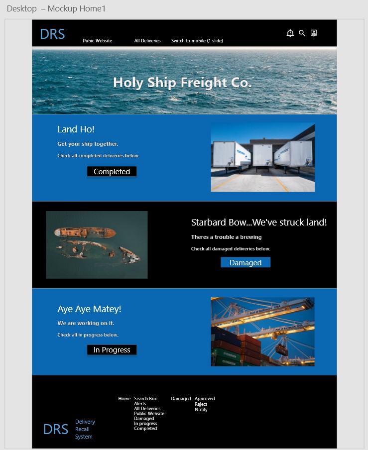
Project: DRS (Deliveries Recovery System) A desktop (and responsive for mobile) intranet site for a damaged delivery reporting flow for a freight company that uses ships.
Role: Lead UX Designer
(Active Role includes the following: User Research, Wireframing, Prototyping, User Testing, Iterating on designs, Responsive Design, Adobe Creative Cloud skills)
Duration March 2022 (1 month)
Design a damaged delivery reporting flow website for a freight company that uses ships.
User Pain Points
1. Damaged delivery arrives and customer has to solve the issue.
2. User wants to be aware of issue before it gets to customer.
3. User wants to able to take action if possible when there is a problem.
4. Additional cost due to of 3rd party automation.
5. Easy to navigate flow that won't require training.
A series of research methods were used to gather data for the DRS intranet site. Given the time, providing an incentive for participants, research processes, and other logistics I chose to do a mix of research methods that allowed me to gather both the attitudes vs behavior and qualitative vs quantitative data.
Research Methods
INTERCEPT SURVEYS were used to gather behaviors or attitudes as close to reality as possible, on why or how to fix a problem the app is trying solve as a screener survey.
CUSTOMER FEEDBACK was used to gather attitudes as close to reality as possible on why or how to fix a problem then how many with DRS site.
UNMODERATED UX STUDIES were used to focus the insights on specific usage aspects, however, through only embedded survey questions, giving participants goals and scenarios to accomplish with a prototype.
EMAIL SURVEYS were used to gather attitudes of the brand or larger cultural behaviors, not so much usability or usage. The concept of use stems from de-contexualized/not using product as it is not a real brand or product yet. For this method, participants are recruited from an text (sms) message in this case. I found the method of texting (via SMS) trends in which participants are more receptive to vs email when from a trusted number given this actual research pool.
From there, in addition, we generated a user journey, audit, create personas and did a competitive analysis in order to best empathize with the user.

Questions the project explored
Research Conducted Examples & Usability Findings
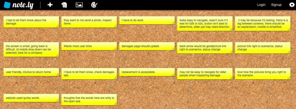
A user testing website was created as observational and face to face contact was a concern for some, given the pandemic. Given that challenge, we found that unmoderated ux studies were effective to reach people in quarantine. Using that additional data we were able to create an affinity diagram and further iterate on how best solve the users problems. The diagram was organized by process steps to isolate where users were getting stuck. From there we were able to see patterns to create insights to align the users needs with the business goals of the project.
Affinity Diagram
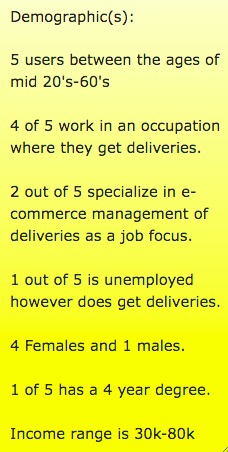
Research Pool
User Persona (1)
User Persona (2)
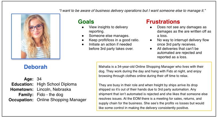
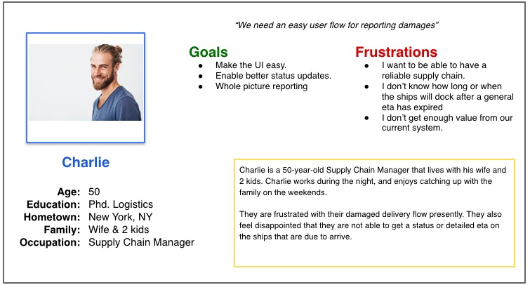
Summary of competitive analysis findings.
I looked at several potential competitive companies and while there was not a way to tell if they had an internal damaged delivery reporting flow, there was a mention of "Quality Control" services, , "logistics solutions", "issue resolution", being able to "track your shipment", and "alerts" that boast "end-to-end-visability".
The majority of the features between competitors were mainly focused on getting you to the correct type of delivery option however the main differences that we noticed for damages were the following:
No mention of process specifically for "damaged" deliveries vs Holy Ship is specifically for damages internally.
Case studies that boast about contacts being a "call away" vs Holy Ships solution going to both the customer and sales contact.
You need to have a relationship with sales vs Holy Ship is also sales relationship reliant.
Main focus is on trade routes vs Holy Ship does maintain port details it's mainly to triangulate issues with damages.


Preparing the Journey
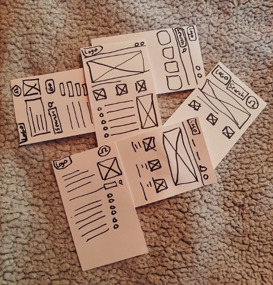
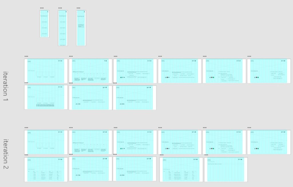
Iteration(s)
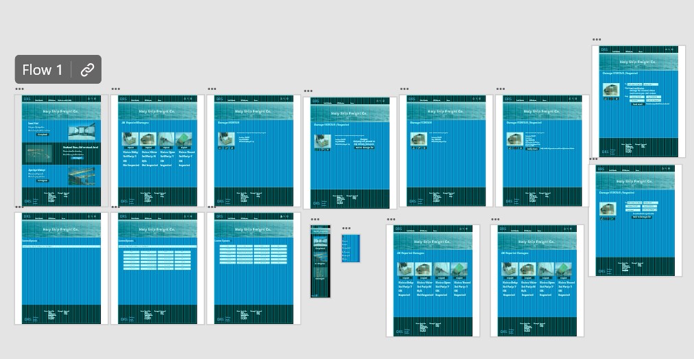
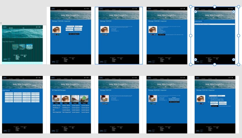
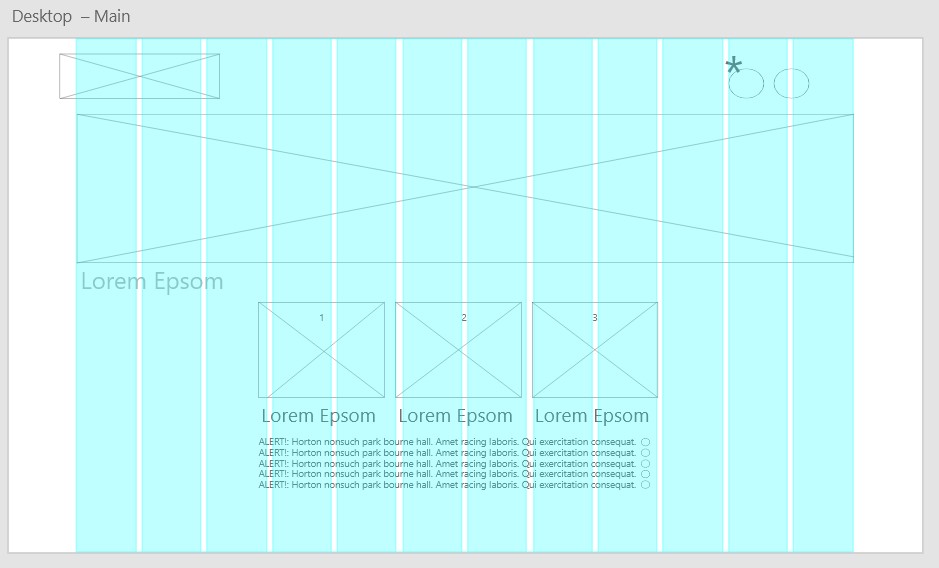
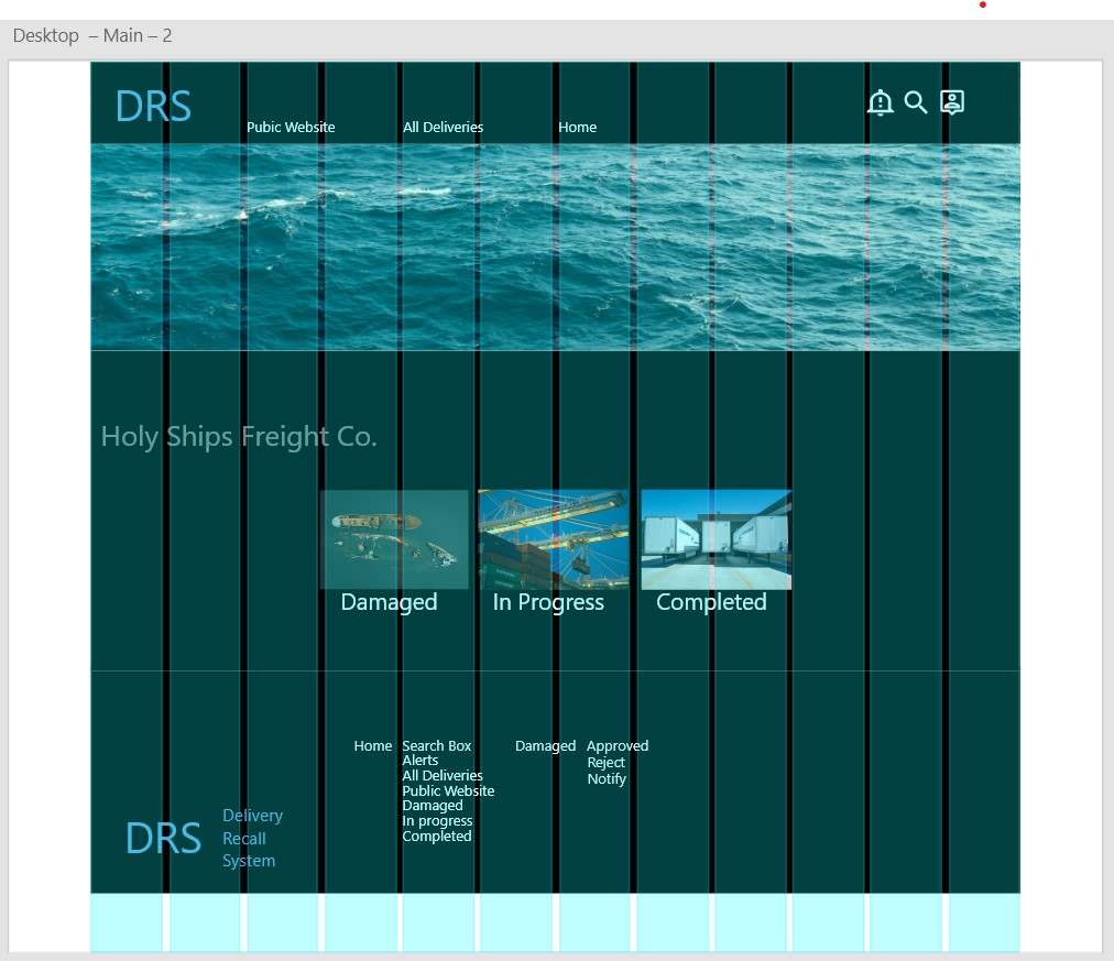
After creating our prototype from low fidelity wireframes, I prepared a survey for participants to fill out before we began conducting a usability test. We asked 5 different participants to run though different scenarios in our prototype in hopes of garnering enough feedback to use for our next set of design iterations. Below is the before.
Pain Point 1
1. Recipient gets the delivery and has to work if there is a damage issue.
The work flow enables the business to inspect and document damaged deliveries that may not meet the expectations of the customer from the port. In this scenario, the business works with a 3rd party that automatically takes deliveries from the ship port to the land destination. The 3rd parties end goal is to complete the delivery, not to fix the presentation of deliveries. Allowing an inspection picture lets the business know what is happening before the customer gets it from the port but also allows the business to fix something based on presentation if needed instead of leaving it up to the customer.
Pain Point 2
2. User wants to be aware of issues before it gets to customer.
This is something that is a work in progress as we can already track packages, this solution would sit with a 3rd party delivery company. From both a B2B and B2C perspective, this is already proven to be valuable. The next step that this user flow takes is that when there is an issue, the client can be emailed to give them a visual heads up before they get the delivery.
Pain Point 3
3. User wants to able to take action if possible when there is a problem.
From a B2B perspective this is a very valuable feature within the user flow. As I mentioned above, the user flow enables the user this capability.
Pain Point 4
5. Additional cost due to 3rd party automation.
In this scenario, the user is capitalizing on drop shipping to automate their business. This presents an issue when it comes to the presentation of the delivery when it gets to the customer. The third party is only interested in getting packages from port to customer as they are incentivized on timely delivery as well as completed delivery. Using this workflow cuts the cost of chargebacks, cost of shipping returns, and reduces the pileup of returns all by being able to visually mitigate from the port.
Pain Point 4
5. Easy to navigate flow that won't require training.
This was achieved by checking with accessibility standards websites and implemented with color use, headings, and landmarks. 1 out of 5 persons from our research commented that older users would have trouble with the navigation. Of our users over 40 years old working in a profession that gets and personally had experience getting deliveries found the navigation, "very user friendly".
1. Recipient gets the delivery and has to work if there is a damage issue.
The work flow enables the business to inspect and document damaged deliveries that may not meet the expectations of the customer from the port. In this scenario, the business works with a 3rd party that automatically takes deliveries from the ship port to the land destination. The 3rd parties end goal is to complete the delivery, not to fix the presentation of deliveries. Allowing an inspection picture lets the business know what is happening before the customer gets it from the port but also allows the business to fix something based on presentation if needed instead of leaving it up to the customer.
2. User wants to be aware of issues before it gets to customer.
This is something that is a work in progress as we can already track packages, this solution would sit with a 3rd party delivery company. From both a B2B and B2C perspective, this is already proven to be valuable. The next step that this user flow takes is that when there is an issue, the client can be emailed to give them a visual heads up before they get the delivery.
3. User wants to able to take action if possible when there is a problem.
From a B2B perspective this is a very valuable feature within the user flow. As I mentioned above, the user flow enables the user this capability.
5. Additional cost due to 3rd party automation.
In this scenario, the user is capitalizing on drop shipping to automate their business. This presents an issue when it comes to the presentation of the delivery when it gets to the customer. The third party is only interested in getting packages from port to customer as they are incentivized on timely delivery as well as completed delivery. Using this workflow cuts the cost of chargebacks, cost of shipping returns, and reduces the pileup of returns all by being able to visually mitigate from the port.
Pain Point 4
5. Easy to navigate flow that won't require training.
This was achieved by checking with accessibility standards websites and implemented with color use, headings, and landmarks. 1 out of 5 persons from our research commented that older users would have trouble with the navigation. Of our users over 40 years old working in a profession that gets and personally had experience getting deliveries found the navigation, "very user friendly".
Style Guide
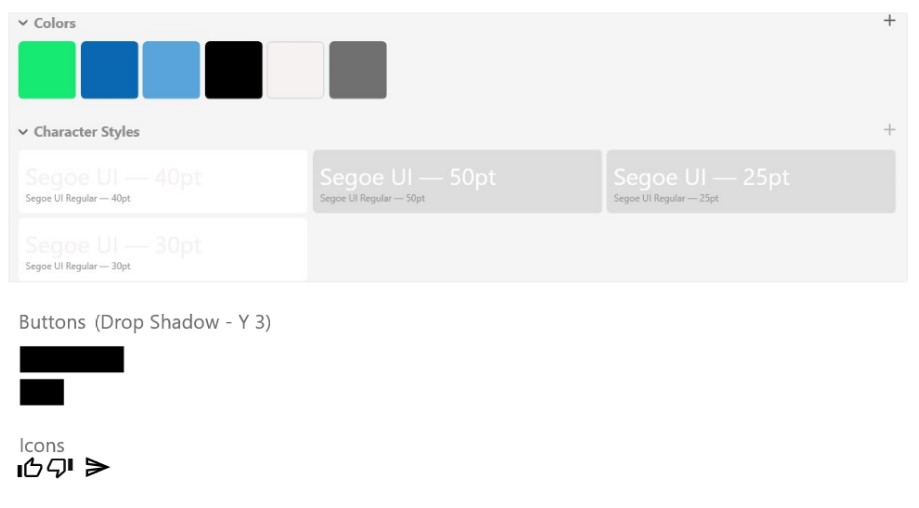
Colors were chosen to meet accessibility standards so the website/app could be accessible for all. Below is the next set of design iterations after.
